Your company's corporate identity reflects your company's image and culture. It can work for you or against you; but it will never be neutral.
Your identity communicates precisely how you view yourself and how you wish the rest of the world to view you.
It is that complex.
We help you articulate visually who you are, what you do and how well you do it.
It is that simple!
Logo for a start=up AI technology group
Logo for a doctorate-level nurse practitioner who is providing beauty-related services in the Chicago area.
Logo for a construction management company
Rio Dulce, a hurricane hole for cruising sailors, is a great place to hang. Here's a concept created for the Tortugal River Lodge.
Logo for a new mobile gift wrapping business
Logo for an emergency EV roadside battery-charging service
The client wanted a logo that reflected the signage of the 1800's for her profession.
At last! Now there is a regulatory company that certifies the accuracy that EV-charginging stations are actually giving you the charge you are paying for.
Logo for a worthwhile non-profit.
NOPE: the logo says it all.
Signage and logo for a traveling boiled peanut cart in the South.
Regional Midwest financial planners wanted to convey that financial well-being requires long-term nurturing, much like a small seedling.
A new entertainment project
The Corporation for Public Broadcasting—I get it that they have that 1960's circle thing going on. So here's my rebuild of their existing logo. here—done solely for me!
Client wanted a "fun" logo!
Restaurant identities are almost always fun projects.
Healthcare network with the graphic combining the symbol for the Trinity together with a heart to represent both healthcare and compassion.
I wanted to capture that lazy day end-of-summer feeling when the light becomes more mellow in the late of the day.
Logo for a new Indian restaurant in Redondo Beach, California.
When your client is named "Fly Brand," you really have your work cut out for you!
Proposed reality tv show following the sometimes very dangerous lives of tugboat crews.
Logo development
Logo for a foundation that provides Christmas trees to others.
Steve has been my go-to photographer of choice for more than a quarter century. Check out his website: stevejostphotography.com
The name says it all.
My client had only two requirements: keep it casual and use a "handrwiting" rather than a formal font.
Logo for a high-end sneaker retailer
A restaurant that wanted an elegant, up-scale minimalist feel—exactly like you'd find on a corner in one Rome's better neighborhoods.
.
Nationally known for its marine programs, they teach more than 115,000 students & 8,000 teachers annually.
Beer made in the North Woods by elves.
A charter air service to Santa Catalina Island from Long Beach. Gave it an old-time feel to match the retro island vibe of the old Casino.
Logo for a yacht builder in Newport Beach CA
A logo designed to be a synthesis of nature and technology.
Logo for an accounting firm in Princeton, NJ
Client had about six different images he wanted in this. Did this instead. Less is often more.
There is something about these dumbbells that I really like—its the deceptive simplicity of the graphic.
Big and bold, this is exactly what you want on a rig 40+ feet long.
But to see it, you'll spend a lot of time driving the interstate system.
Logo for a Laguna Beach restaurant serving the best catfish in town.
New logo for an established professional employment service.
Always good to have friends in the wine biz. I don't know how many cases they produce, but this '20 Syrah is what they have to be holding in their hands to get into my home.
What could be more appropriate for high-end clothing & accessories stores? I first saw this typeface and I knew that I would be one day be using it in a design. Notice the "oq" ligature.
Concept for an on-line gossip blog about Orange County, California. The job: make it fun, a bit sleazy and somewhat teasy. Wowsers!
Delivered a file and the next day my client used his water-jet machine to cut it out of aluminum. Here it is still wet from the machine.
Concept for a Miami confectioner. Color is everything in this logo—communicating exactly the colors of her products—yum!.
An avid wooden boat kinda-guy, I always am happy when designing for worthy ocean-related programs.
The need was to communicate a solid presence as well as enduring timelessness. Looked at a lot of gryfins from history before creating this one.
Concept for a tree service company
Since the thistle is part and parcel of Scottish identity, what better to represent another part of traditional Scottish life?
This foundation provides support for first responders.
Briseno Landscape is an incredible service. They are absolutely amazing people and deserve an amazing logo!
When you build hot rods for a living, nothing says that better than good flames.
Not every logo has to to be complicated. Here's a simple graphic that is a powerful reflection of this business's purpose.
A logo for a non-profit using my graphics tablet to create the minimalist track shoes.
Well, it's supposed to be a '39 hot rod… but when was the last time
you saw one with a brand spanking new Aston-Martin V12 in it?
The client wanted a logo that communicated the openness and acceptance that characterized this congregation. The "Advent" script is handmade and not a font.
First concept for a new musical.
Trumpy motoryachts were the yachts of tycoons and presidents. I used classic "swashes" to connote elegance. The one on the left is the classic Trumpy scroll found on the bow of all Trumpy-built yachts.
Ornaments were a traditional part of the typographer's craft back in the 1900s. Here, I take one I particularly like and turn it into a client's logo.
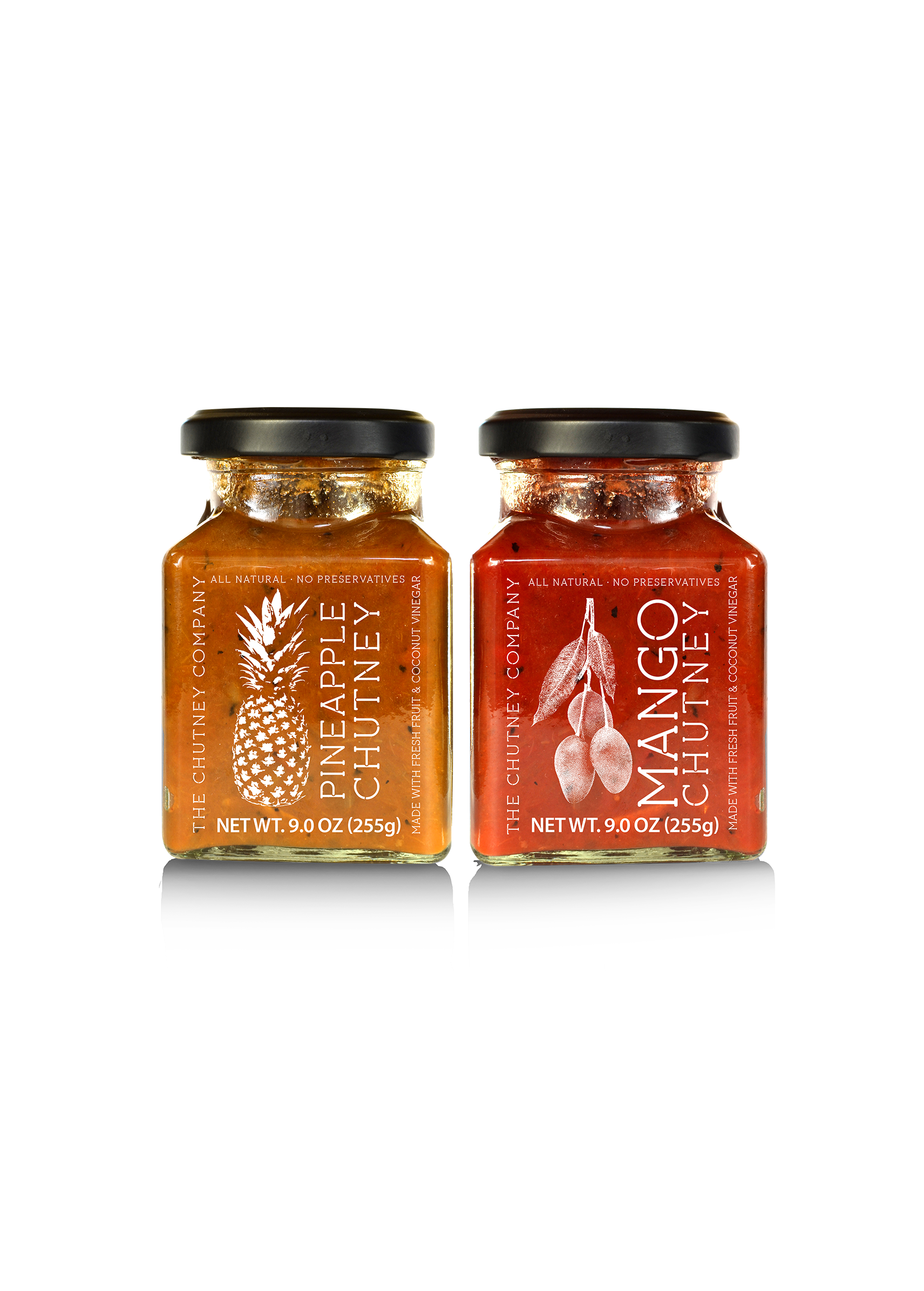
For a small company setting up pharmaceutical protocols and manufacturing processes.
Graphic created for a friend and master chef who has cooked for four U.S. presidents—and for one of the world's top master sommeliers.
A logo created solely as a demonstration for one aspect of logo design. Read more on my Linkedin page.
Epic, based in Orlando, is an entertainment production company staffed by former Disney executives.
Check out the ligature between the "m" and the "a.' Also, I gave the "o"s those frizzy little tops that make them look like, well... tomatoes.
Logo for a germ sanitizing company working in health care.
Logo for a construction management company
Rio Dulce, a hurricane hole for cruising sailors, is a great place to hang. Here's a concept created for the Tortugal River Lodge.
Logo for an emergency EV roadside battery-charging service
The client wanted a logo that reflected the signage of the 1800's for her profession.
Logo for a worthwhile non-profit.
NOPE: the logo says it all.
Signage and logo for a traveling boiled peanut cart in the South.
Regional Midwest financial planners wanted to convey that financial well-being requires long-term nurturing, much like a small seedling.
A new entertainment project
The Corporation for Public Broadcasting—I get it that they have that 1960's circle thing going on. So here's my rebuild of their existing logo. here—done solely for me!
Client wanted a "fun" logo!
Restaurant identities are almost always fun projects.
Healthcare network with the graphic combining the symbol for the Trinity together with a heart to represent both healthcare and compassion.
I wanted to capture that lazy day end-of-summer feeling when the light becomes more mellow in the late of the day.
Logo for a new Indian restaurant in Redondo Beach, California.
When your client is named "Fly Brand," you really have your work cut out for you!
Proposed reality tv show following the sometimes very dangerous lives of tugboat crews.
Logo development
Logo for a foundation that provides Christmas trees to others.
Steve has been my go-to photographer of choice for more than a quarter century. Check out his website: stevejostphotography.com
The name says it all.
My client had only two requirements: keep it casual and use a "handrwiting" rather than a formal font.
Logo for a high-end sneaker retailer
A restaurant that wanted an elegant, up-scale minimalist feel—exactly like you'd find on a corner in one Rome's better neighborhoods.
.
Nationally known for its marine programs, they teach more than 115,000 students & 8,000 teachers annually.
Beer made in the North Woods by elves.
A charter air service to Santa Catalina Island from Long Beach. Gave it an old-time feel to match the retro island vibe of the old Casino.
Logo for a yacht builder in Newport Beach CA
A logo designed to be a synthesis of nature and technology.
Logo for an accounting firm in Princeton, NJ
Client had about six different images he wanted in this. Did this instead. Less is often more.
There is something about these dumbbells that I really like—its the deceptive simplicity of the graphic.
Big and bold, this is exactly what you want on a rig 40+ feet long.
But to see it, you'll spend a lot of time driving the interstate system.
Logo for a Laguna Beach restaurant serving the best catfish in town.
New logo for an established professional employment service.
Always good to have friends in the wine biz. I don't know how many cases they produce, but this '20 Syrah is what they have to be holding in their hands to get into my home.
What could be more appropriate for high-end clothing & accessories stores? I first saw this typeface and I knew that I would be one day be using it in a design. Notice the "oq" ligature.
Concept for an on-line gossip blog about Orange County, California. The job: make it fun, a bit sleazy and somewhat teasy. Wowsers!
Delivered a file and the next day my client used his water-jet machine to cut it out of aluminum. Here it is still wet from the machine.
Concept for a Miami confectioner. Color is everything in this logo—communicating exactly the colors of her products—yum!.
An avid wooden boat kinda-guy, I always am happy when designing for worthy ocean-related programs.
The need was to communicate a solid presence as well as enduring timelessness. Looked at a lot of gryfins from history before creating this one.
Concept for a tree service company
Since the thistle is part and parcel of Scottish identity, what better to represent another part of traditional Scottish life?
This foundation provides support for first responders.
Briseno Landscape is an incredible service. They are absolutely amazing people and deserve an amazing logo!
When you build hot rods for a living, nothing says that better than good flames.
Not every logo has to to be complicated. Here's a simple graphic that is a powerful reflection of this business's purpose.
A logo for a non-profit using my graphics tablet to create the minimalist track shoes.
Well, it's supposed to be a '39 hot rod… but when was the last time
you saw one with a brand spanking new Aston-Martin V12 in it?
The client wanted a logo that communicated the openness and acceptance that characterized this congregation. The "Advent" script is handmade and not a font.
First concept for a new musical.
Trumpy motoryachts were the yachts of tycoons and presidents. I used classic "swashes" to connote elegance. The one on the left is the classic Trumpy scroll found on the bow of all Trumpy-built yachts.
Ornaments were a traditional part of the typographer's craft back in the 1900s. Here, I take one I particularly like and turn it into a client's logo.
For a small company setting up pharmaceutical protocols and manufacturing processes.
Graphic created for a friend and master chef who has cooked for four U.S. presidents—and for one of the world's top master sommeliers.
A logo created solely as a demonstration for one aspect of logo design. Read more on my Linkedin page.
Epic, based in Orlando, is an entertainment production company staffed by former Disney executives.
Check out the ligature between the "m" and the "a.' Also, I gave the "o"s those frizzy little tops that make them look like, well... tomatoes.
Logo for a germ sanitizing company working in health care.
R L GEISMAN | ADVERTISING DESIGN
31620 Scenic Dr | Laguna Beach, CA 92651 | 949.499.2100 |
ron@rlgad.com
All Rights Reserved | R L Geisman | Advertising Design